HomeHome

Erik Cox
Uitgelicht /
Videos & Up-Close

To top uitgelicht - up close


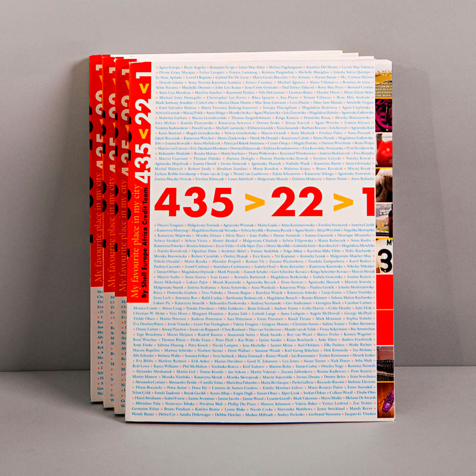
PROJECT 435>22>1: MY FAVOURITE PLACE IN MY CITY

Published by: Shell Downstream Services International b.v.
Project concept, coordination & graphic design: Erik Cox
Photo lithography: Gerard Bik, The Hague
Language editing: Andy Brown, ’s–Hertogenbosch
Printing: Zwaan Printmedia, Wormerveer
Binding: Binderij Hexspoor bv, Boxtel
Print run: 500 copies
© 2013 Erik Cox / the photographers / the authors


Het project 435>22>1

De 435 mensen in het Shell EUAF Credit Team van Jacques Vincken werken wereldwijd op 22 locaties in 22 teams en spreken elkaar voornamelijk over de telefoon of hebben contact per email.

Uitgangspunt was: Wat zou je graag jouw collega's uit andere landen laten zien als ze bij jou op bezoek komen in jouw stad?

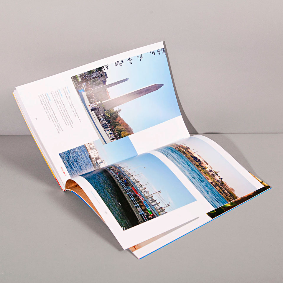
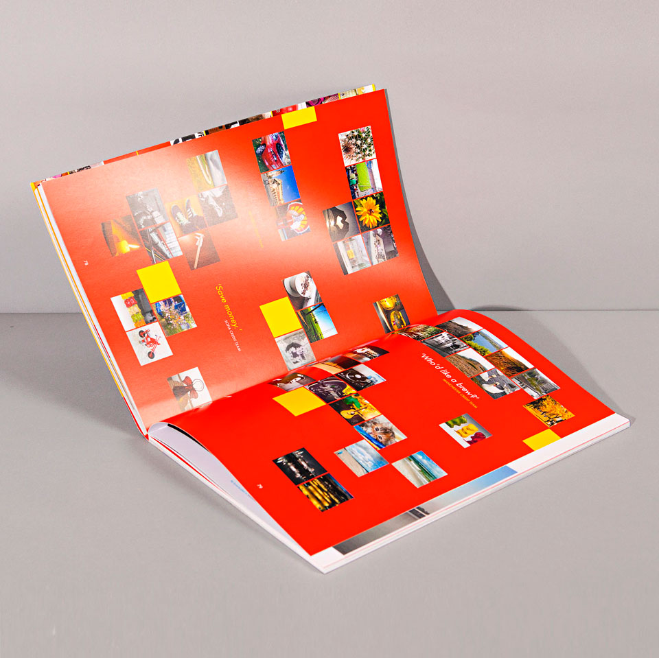
Met dat gegeven zijn de teams lokaal in teamverband en individueel foto's gaan maken van hun favoriete plaatsen in de steden waarin ze werken en die ze graag wilden delen. Van de plekken die hun leven in die steden leefbaar en bijzonder maken, maar niet van de toeristische highlights. En van het gebouw waarin ze werken.
Daarnaast maakte iedereen zijn eigen 'handtekening'-foto van iets dat hun persoonlijkheid representeert, bijvoorbeeld een geliefd voorwerp.

Het merendeel van de in totaal 647 foto's kwam binnen per mail. Ik had frequent overleg met zo'n 50 mensen. Over hun foto's, de verbeelding in hun 'signature' picture, en over de teksten die ze bij de favourite places schreven. Het werd een 160 pagina's dik 'koffietafel-boek', bijna 9 gigabytes aan data!

Een boek met 435 auteurs

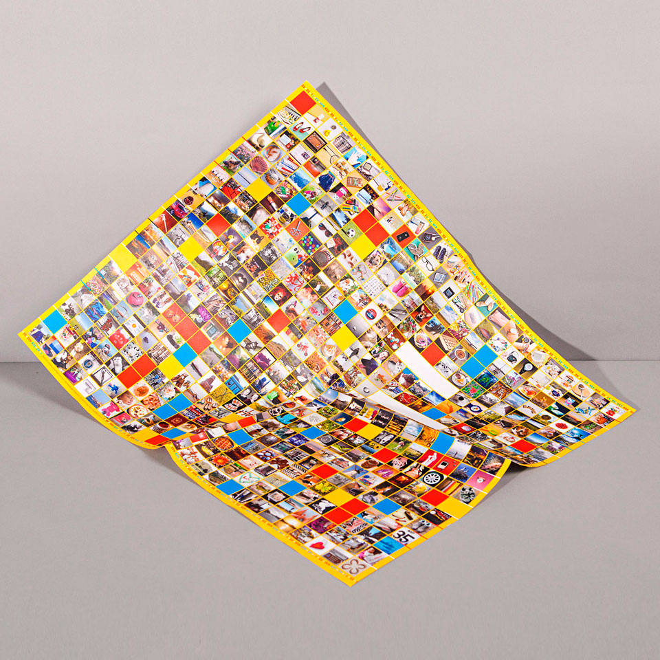
De teams en teamleden waren bijzonder blij en verrast bij de ontvangst van de boeken. Ingepakt in pakpapier waar alle 'signatures' uit het binnenwerk allemaal bijelkaar op gedrukt waren, was dit inderdaad echt hun eigen boek geworden. Een boek dat zij met elkaar hadden gemaakt. Een waar 'familie-boek' zoals iemand schreef. Met al hun 435 namen als auteurs op het omslag.

Uniek

Het project heeft iets teweeg gebracht. Binnen zo'n grote organisatie als Shell is het - denk ik - ongekend dat een Credit Manager zijn teams en teamleden op deze manier met elkaar verbindt en met elkaars leefwereld laat kennismaken, wereldwijd.

De diversiteit van dit project, het contact met de mensen, het enthousiasme en de creativiteit waren zeer inspirerend. Ik vond het een uitzonderlijke, alomvattende ervaring om hieraan mee te werken. Van concept, briefing, updates en projectbegeleiding voor de 22 credit teams en individuele teamleden tot ontwerp omslag en lay-out van de pagina's, begeleiding van lithografie, tekstediting en drukwerk tot en met distributielijsten voor de verzending.

De doelstelling is, afgaande op de vele reacties die Jacques Vincken binnenkreeg, ruimschoots bereikt: de 22 teams zijn trots op wat ze samen als 1 team tot stand hebben gebracht, gaan virtueel bij elkaar op bezoek en leren elkaar anders en beter kennen.


Project 435>22>1

The 435 people in Jacques Vincken's Shell EUAF Credit Team are spread over the world at 22 locations in 22 smaller teams. Their main contact takes place verbally, on the telephone or via email.

The starting point of this project was: What would you most like to show your colleagues from other countries if they come to visit with you in your town?

With that theme established, each local team made photographs -- sometimes as a team, sometimes individually -- of their favourite places in the cities where they work; the places they'd want to share with visitors. Instead of the tourist highlights, as they are already to be found in other books, they chose the places that make their cities enjoyable for residents. And one of the Shell building in which they work, this was the one photograph that all teams had to make.

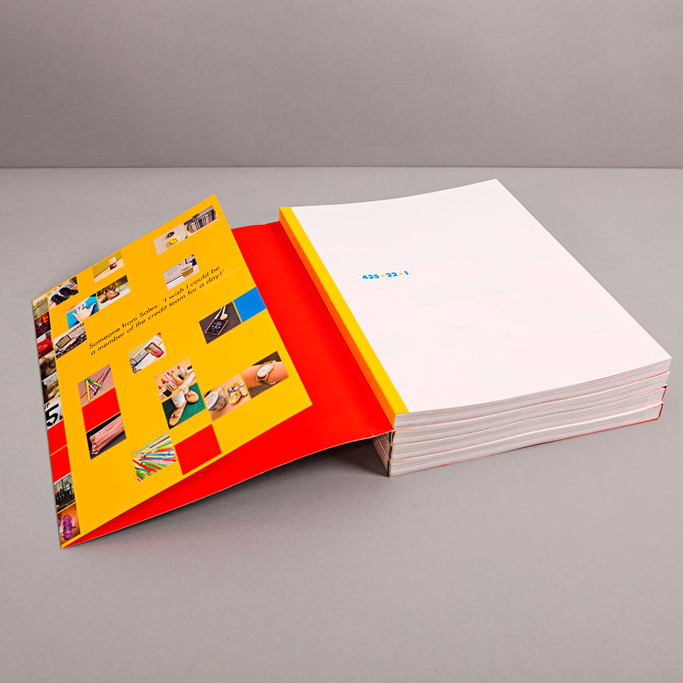
In addition, everyone made his own signature picture of something that represents their personality, such as a beloved object.

I received most of the 647 photos by email, and I consulted frequently with about 50 individual contributors and/or local team leaders. We talked about their photos and what their signature pictures meant, and discussed the texts they wrote about the selected favourite places. It became a 160-page thick coffee table book, including almost 9 gigabytes of data!

A book with 435 authors

The teams and team members were pleased and surprised when they received the book. We had also printed all the signature photos from the interior of the book on white packing paper and packaged each book in that paper. It was indeed in every fibre their own book, right down to the packaging -- a book that they had made together. A true "family book" as someone wrote, with all of their 435 names as authors on the cover.

Unique

The assignment gave people a chance to feel ‘seen’, not only as employees and colleagues, but also a more personal side of themselves. We tapped into their creativity, which stimulated many of the team members to make really good photos with personalized notes about them. They were happy to try again if what they’d made didn’t meet the assignment. In the end, the project has triggered more fellowship in both the local teams and in the world-wide team as a whole.
Within an organization as large as Shell is, it is - I think - unprecedented for a Credit Manager, his teams and his team members to connect in this way with each other and each other's environment, getting acquainted with each other's daily life despite being spread over the globe.

The diversity of this project, working with Jacques, the contact with the people, their enthusiasm and creativity were inspiring. From the concept, briefings, updates, and project management for the 22 credit teams and individual team members, right on through to cover design and layout of the pages, accompanied by lithography, text editing and printing to distribution lists for sending -- all of it was a pleasure for me and an exceptional, comprehensive experience.

Judging by the many positive comments that Jacques Vincken received, it's clear that our objective was achieved. The 22 teams are proud of what they have created working as a single world-wide team: they can visually visit each other's daily worlds via the photographs, thus getting to know each other in a new and broader way than only via telephone and email.


To top uitgelicht - up close


DE EERSTE AGENDA VAN VILLA AUGUSTUS ANNO 2014 i.s.m. Dorine de Vos

Eerste prijs in de categorie Agenda's van de Kalenderwedstrijd 2014

Zomer 2013 hebben we er 6 weken aan gewerkt, De Vos concentreerde zich op de inhoud, Cox zette alles op zijn plek en gaf vorm. We bemoeiden ons zeer met elkaars werk. Het is een prachtig project geweest. 160 pagina’s vol met inspiratiebronnen van Dorine. Full-colour, op mooi dun papier en tot in een punt gebonden. Vol met foto’s, verhalen, citaten, lijstjes, tekeningen en QR codes. Niet eerder heb ik 34 lettertypes gebruikt in één uitgave!

(Preview 32 pagina's, 4,9 MB PDF)


THE FIRST AGENDA / DATE DIARY OF VILLA AUGUSTUS ANNO 2014 collaboration with Dorine de Vos

First prize in the category Blogs Calendar Contest 2014

It's summer 2013, we have six weeks to work, De Vos is focused on the content, Cox puts everything in its place and gives it design shape. We interfere freely with each other's work, delighting in debate and the exchange of design ideas. It has been a wonderful project. 160 pages full of Dorine's lifelong sources of inspiration. Full-colour, printed on lovely thin paper and exquisitely bound. Packed with pictures, stories, quotes, lists, drawings and QR codes. Never before have I used 34 fonts in a single publication!

(Preview 32 pages, 4,9 MB PDF)


To top uitgelicht - up close


CHRISTMAS PRESENT 2012 FOR THE SHELL EUAF CREDIT TEAM

Zomer 2012 vroeg Jacques Vincken van Shell mij om met hem te brainstormen over een kerstcadeau voor zijn ‘Europe Africa Credit Team’. Het jaar ervoor had hij een managementboek met fraaie foto’s gegeven. De voorkeur ging uit naar opnieuw een boek. Verder kreeg ik de vrije hand om iets passends te bedenken. Het team van Jacques bestond uit 472 financieel deskundigen die wereldwijd werkten op 22 locaties.

Hoewel Kerstmis en winter niet voor alle culturen overal en tegelijkertijd opgaan, is het wel een speciale tijd van het jaar. Iedereen bij Shell heeft dan even vrij. Even geen ‘werk’, maar tijd voor familie, thuis en gezellig samenzijn. Samen eten, kerstmenu’s…

Jacques Vincken vertelde me dat ook voor hemzelf de kerstperiode die spaarzame gelegenheid bood om uitgebreid te kunnen koken. Daarmee was de stap gezet om dat jaar een kookboek als bedrijfscadeau te geven. En niet zomaar een kookboek. Als vanzelf ontvouwde zich vanaf dat moment een bijzondere optie. De Home Made kookboeken van de Nederlandse Yvette van Boven, door haarzelf vormgegeven en geïllustreerd, waren inmiddels zó succesvol dat 'Home Made Winter' dat najaar in Engelse vertaling zou verschijnen. Daarmee hadden we een engelstalig ‘Nederlands’ cadeau voor medewerkers van een, van origine, Nederlands bedrijf. Yvette was bereid ze allemaal persoonlijk met de hand te signeren en ook nog stuk voor stuk te voorzien van een handgeschreven opdracht aan het team!

Ik vroeg Jacques Vincken naar zijn eigen favoriete recept. Toen dat Coquilles Saint Jacques bleek te zijn, was de cirkel rond: schelp-coquille-recept en Shell-logo-schelp met ‘Jacques’ als verbindende factor.

Yvette illustreerde met toepasselijke tekeningen zowel het Coquilles/Shell-recept als de begeleidende brief waarin teruggeblikt werd op het financiële jaar.

Met de brief en het recept bovenop het boek werd alles verpakt. Nee, niet in kerst inpakpapier, maar in een klassiek geruite theedoek met een grote rode strik eromheen. Alles verstuurd. Van Manila tot Glasgow & van Oslo tot Kaapstad zeer enthousiast ontvangen.


CHRISTMAS PRESENT 2012 FOR THE SHELL EUAF CREDIT TEAM

In the summer of 2012, Shell manager Jacques Vincken asked me to brainstorm with him about a Christmas gift for his 'Europe Africa Credit Team'. He had given his staff a management book the year before with beautiful pictures. His preference was to do a book again. Aside from this choice, he left me free to think of what would be suitable. Jacques's team consisted of 472 financial experts working in 22 locations worldwide.

Even though winter doesn't come at the same time in all places and not all cultures celebrate Christmas, the December solstice is everywhere a special time of year. All Shell employees get some time off. It's a moment to set work aside and have a sea of time for home and family and being together with relatives and friends. Eating together, planning Christmas menus ...

Jacques Vincken told me that for him the Christmas period provided a sparse opportunity to do some extensive cooking. That remark sparked my idea to make this year's book a cookbook -- but not just any old cookbook, I had a better option in mind. 'The Home Made Cookbooks' by Dutch Yvette van Boven, designed and illustrated by her, were such a hit that 'Home Made Winter' was going to appear in English translation that year's autumn. And so we had an English-language 'Dutch' gift for the employees of what had originally been a purely Dutch company. Yvette was willing to personally sign all of the books by hand and also to provide each copy with a hand-written dedication to the team!

I asked Jacques Vincken what his own favourite recipe was. When that turned out to be Coquilles Saint Jacques, we had come full circle: we'd add a shellfish recipe, matching the famous Shell seashell logo, with 'Jacques' as a unifying factor.

Yvette was glad to illustrate Jacques's scallops recipe and the letter of appreciation that was included, reviewing the international team's financial achievements in the now ending year.

Everything was packaged with the letter and Jacques's recipe on top of the book. No, not in Christmas wrapping paper, but in a classic Dutch plaid tea towel with a big red bow. All were sent. This Christmas gift was received with enthusiasm from Manila to Glasgow and from Oslo to Cape Town.


To top uitgelicht - up close


LOGO VOOR DEN HAAG CULTUUR IN BEDRIJF

Den Haag Cultuur in Bedrijf wil een duurzame relatie tussen culturele instellingen, bedrijfsleven en maatschappelijke partijen en overheid in de stad tot stand brengen.

In het logo worden ‘overheid’, ‘cultuur’ en ‘bedrijf’ vertegenwoordigd door ieder een kubus en een eigen kleur. Samen vormen zij de bouwstenen voor dat wat dialoog en samenwerking tussen partijen kan opleveren: alleen door een open dialoog en nauwe onderlinge samenwerking kunnen zij een vierde bouwsteen creëren. Een vierde dimensie [de vierde ‘kubus’ in hun midden].
In het patroon worden ook de raten van een bijenkorf zichtbaar wat symbool staat voor samenleving en maatschappij.

Het beeldmerk is een Haags-culturele knipoog naar zowel het werk van Escher als naar dat van Mondriaan.
Het gebruik van de drie primaire kleuren speelt in op de suggestie dat door menging ‘iedere andere kleur te maken is’. Hetgeen de mogelijkheid tot vermenigvuldiging en innovatie symboliseert.
Door te kiezen voor deze kleuren toont het logo zijn verwantschap met het vlieger logo van de stad en met het logo van Den Haag Kandidaat Culturele Hoofdstad 2018.


LOGO FOR DEN HAAG CULTUUR IN BEDRIJF / THE HAGUE CULTURE IN BUSINESS

The Hague project 'Culture in Business' aims to build a lasting relationship between between government, cultural institutions, and business and civil parties in the city.

In the logo, 'government', 'culture' and 'business' are each represented by a cube, each party with its own colour. Together, the cubes form the building blocks for a fourth dimension that only dialogue and close cooperation between the parties can bring about. This fourth dimension is represented by the fourth cube in their midst, which only emerges because of what the three original cubes share.

In the pattern they form, the honeycomb of a beehive can also be seen as a symbol of community and society.

The logo is a Hague cultural nod to both the work of Escher and to that of Mondrian.

The use of the three primary colours is a response to the suggestion that by mixing 'every complex colour can be made'. This symbolizes what the ability to multiply and innovate can achieve.

The logo uses the same colours that make up the kite logo of the Hague and the logo of The Hague Candidate Capital of Culture in 2018, preserving colour coherence throughout the various logos the city uses.


To top uitgelicht - up close


SHELL HUNT FOR CASH TROPHY 2011-2012

Commissioner: Shell Downstream Services International B.V., Jacques G. Vincken
Limited edition: 12x
Material: stainless steel combined with wood
Dimensions: H x W x D: 25,8 x 19 x 13,8 cm, approx. 10.2 x 7.5 x 5.4’’


JACQUES G. VINCKEN (Shell Downstream Credit Manager Europe & Africa, Global Retail and Global Chemicals) created the Hunt for Cash project. It launched in 2011 with 400 staff members in more than twenty-five locations. Its aim: reducing Overdue Debt through more effective Debt Collection, Dispute Resolution and greater efficiencies in Debt Recovery. On the long term: to have a sustainable, fast and pro-active credit process. Jacques and his teams made the project into a huge success, far surpassing the original goals and expectations. The dedication, creativity and skill that the credit teams put into the project went beyond the mere call of duty. Shell wanted to mark this special personal contribution with a trophy for each team.

(327 KB PDF)


ARTIST STATEMENT

The Shell Hunt for Cash program is a project that spans the globe, covering more than twenty-five countries and a broad range of Credit & Risk Management activities. ‘Be alert, stay sharp’ is a conspicuous common theme everywhere the project is operative.

The Crosshair is a feature on the scope of all precision hunting rifles. Combining this with the Target and the Dollar Sign creates a strong image to convey the never flagging vigilance as well as the sighted focus that the project stimulates. The target: reduction of Overdue Debt through more effective Debt Collection, Dispute Resolution, and greater efficiency in Debt Recovery.

The logo the Hunt For Cash started with in 2011 has been restyled for the trophy. The restyling made it possible to translate the two-dimensional image into a more dynamic 3D piece. The 3D version includes a rotating target. This emphasizes the fact that H4$ Credit Management never gets fixated on a single point, but rather scans the entire horizon as it formulates policy and decisions.

The horizon is pictured by the ‘equator’ of the stylized half-globe behind the target. With an incline of 23,44° -- same as the Earth’s axis -- and combined with the Meridians, H4$ covers the world from east to west, north to south.
I chose to use stainless steel combined with wood. Stainless steel has the same silver sheen as ‘argent’ -- French for both silver and money. It’s a hard and resilient material, so it also serves here as a metaphor for unwavering resolution and consistency. The trophy’s foot is of wood, a natural material with a warm, living glow to it. This represents what H4$ really stands on: the people behind it. It’s the 400 staff members in more than twenty-five locations that have made a success of the project.

With heartfelt thanks to Jacques Vincken. It’s been an honor to design this trophy!

The Hague, December 2012


To top uitgelicht - up close


FROZEN DATA - Installatie met 50 SyQuest Removable Hard Disks (Januari 2009 - januari 2017) - 424 x 211 cm

1989-1993 waren de hoogtijdagen van de SyQuest Removable Hard Disks. Ze volgden de kleine floppies (1,44 MB) op en met hun 44 MB of 88 MB, later zelfs 200 MB, waren deze dragers lange tijd ongeëvenaard. CD’s (700 MB) en USB-sticks: pas jaren later zouden ze state of the art worden.

Grafisch ontwerpers gebruikten de dure schijven destijds als middel om hun digitale bestanden te archieveren of om te versturen. Dat laatste gebeurde per post, want ook nog geen internet.

Uit hun bruine plastic beschermhuls gehaald, vormen 50 van deze ronde, spiegelende schijven, 8 jaar lang een stramien op de muur bij grafisch ontwerpbureau Haagsblauw. De SyQuests, inclusief de erop geschreven data, uit hun eigen archief werden aangevuld met de disks van twee andere bureaus.


FROZEN DATA - Installation Art with 50 SyQuest Removable Hard Disks (January 2009 - January 2017) -424 x 211 cm (13.9' x 6.9')

The SyQuest Removable Hard Disk had its days of glory from 1989 to 1993. It was the successor of the smaller floppies that held 1.44 MB and -- with its 44 or 88 MB, later even 200 MB -- remained unequalled for a long time. Only years later would the 700 MB CD and the USB stick replace the SyQuest RHD as state of the art.

Graphic designers used these expensive disks to store their digital files and/or mail them to customers and printers. Back then 'mail' meant snail mail because the Internet didn't exist.

Removed from their brown plastic housing, 50 of these round, reflective disks were incorporated into a design that has graced the wall of Graphic Design Bureau 'Haagsblauw' from 2009 until 2017. The SyQuest RHDs are from Haagsblauw's own archives, supplemented by RHDs from two other graphic design companies. All still hold the data they originally stored.


To top uitgelicht - up close